San Capri
Wildly brewed, Naturally Good.
Packaging & Branding
San Capri is a botanical sweet tea brand inspired by the sensory nostalgia of summer, fresh fruit, fragrant botanicals, warm afternoons and the simple ritual of slowing down.
I created a visual identity that turns those feelings into something tangible, combining expressive typography, hand-drawn illustration and tactile packaging to make San Capri feel as good to hold as it is to drink.
The Challenge
The botanical drinks market is full of brands competing through the same visual language: muted palettes, minimal packaging and predictable botanical imagery.
San Capri needed to communicate natural ingredients and premium quality without becoming another wellness drink.
The opportunity was to create something that felt:
Botanical & premium, but not intimidating.
Playful, but still sophisticated.
Natural, without falling into cliché.
Concept
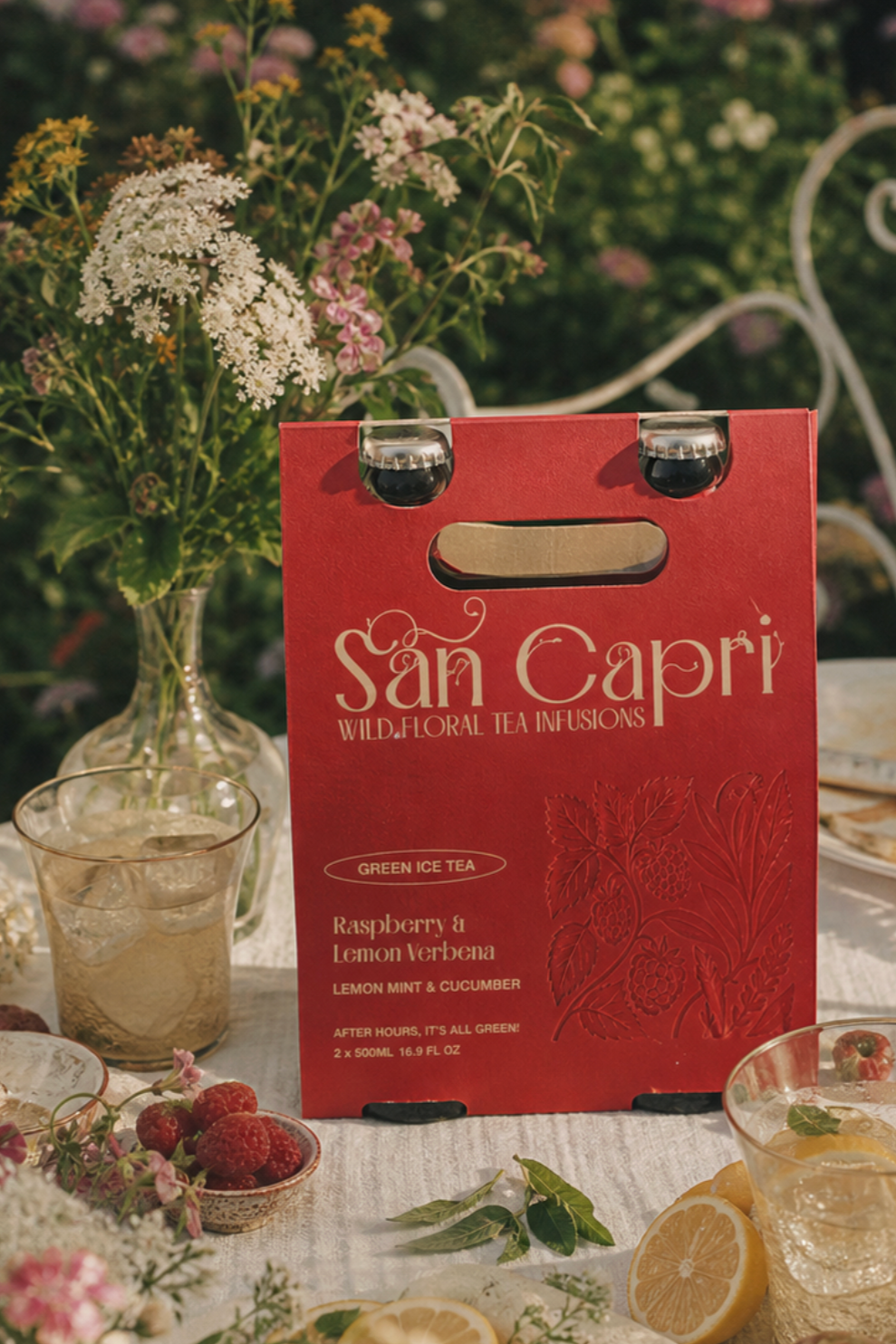
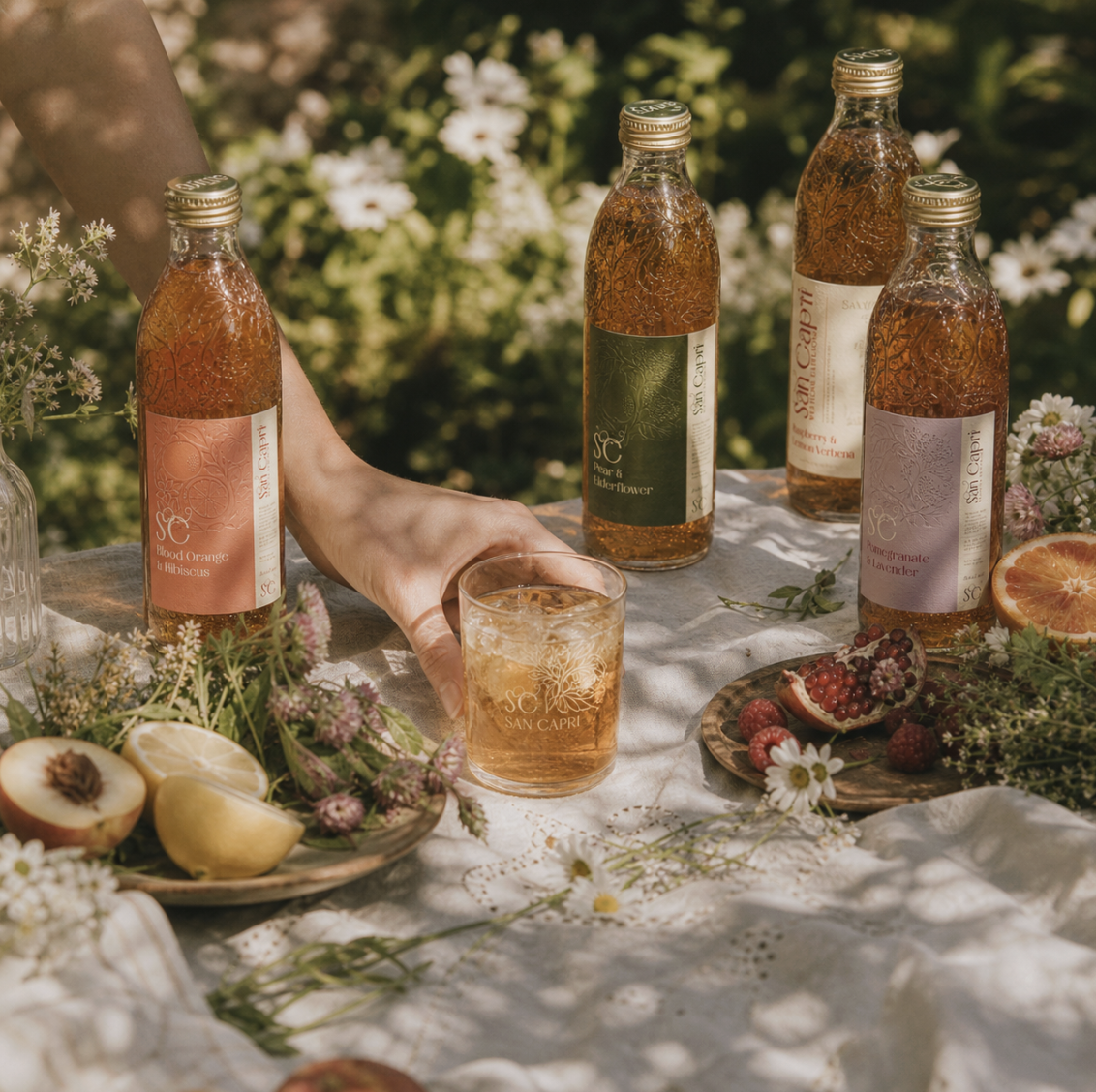
San Capri was built around the idea of turning an everyday iced tea into a small moment of escapism. The concept draws on the feeling of warm, sunny afternoons spent outdoors. With fresh fruit, fragrant botanicals, picnics and slowing down with something refreshing.
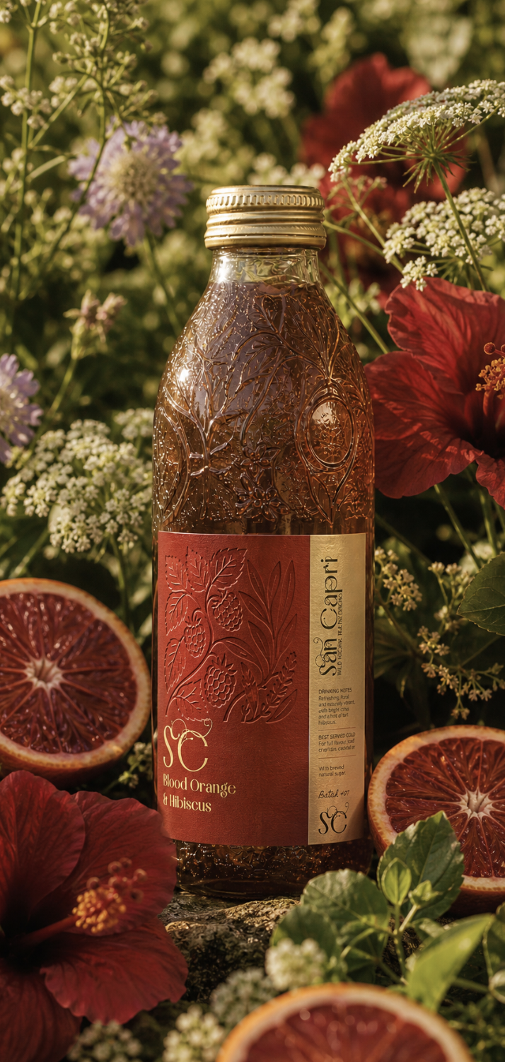
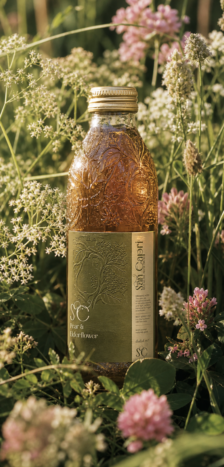
Summer memories are remembered through smell, feelings, and texture, which all needed to be reflected in the design of the bottle. Something felt and enjoyed, which is where the embossed label comes in hand.
The result is a brand that feels like a holiday in a bottle, playful, refreshing and rooted in the beauty of the natural world.
The Insight
Some of our strongest memories are sensory.
The smell of fruit, the feel of sun-warmed skin, the texture of a picnic blanket, the sound of ice in a glass.
I wanted San Capri to tap into that same sensory nostalgia, creating a brand that didn't just communicate its ingredients, but made you feel somewhere.
This shifted the focus from botanical ingredients to the feeling those ingredients create.
Visual Identity
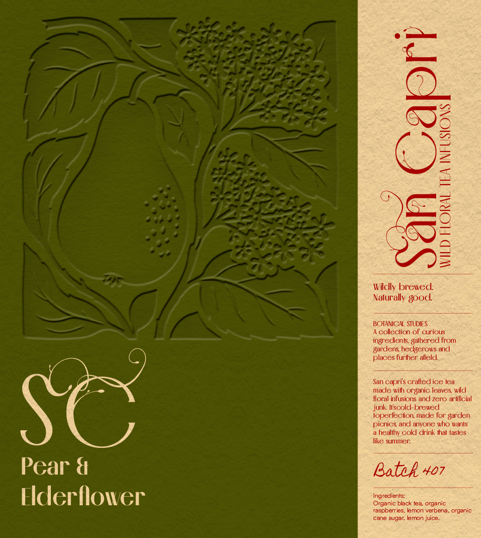
The identity balances the elegance of high contrast typography with the imperfect quality of hand-drawn botanical illustration.
The contrast allows San Capri to sit between premium and playful, avoiding both the clinical feel of wellness brands and the overly rustic language often associated with natural products.
Botanicals with personality
Rather than using botanical imagery purely as decoration, fruits, flowers and foliage become characters within the brand world.
Each illustration gives the flavours their own identity while creating a flexible system that can extend across packaging, patterns and campaign content.
A palette inspired by summer
The colour system draws from the ingredients and environments surrounding the product, creating a collection that feels sunsoaked, fresh and nostalgic…
Designing for the senses
Summer memories aren't only visual. They're remembered through scent, texture, taste and touch.
That became an important consideration for the bottle design. The embossed label gives the packaging a physical quality — something you can feel as well as see.
The tactile finish reinforces the idea that San Capri isn't simply a drink to look at; it's an experience designed to be held, poured and enjoyed.