THE CHALLENGE
DM Commercial Consultants needed a visual identity that reflected the professionalism and precision of its work within the construction industry.
The challenge was to move away from the often predictable visual language of construction and consultancy brands, creating something that felt established and trustworthy without becoming overly corporate.
DM Commercial Consultants
Logo Design · Graphic Design
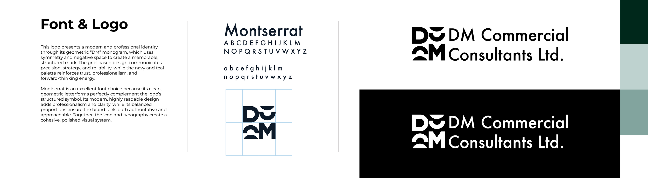
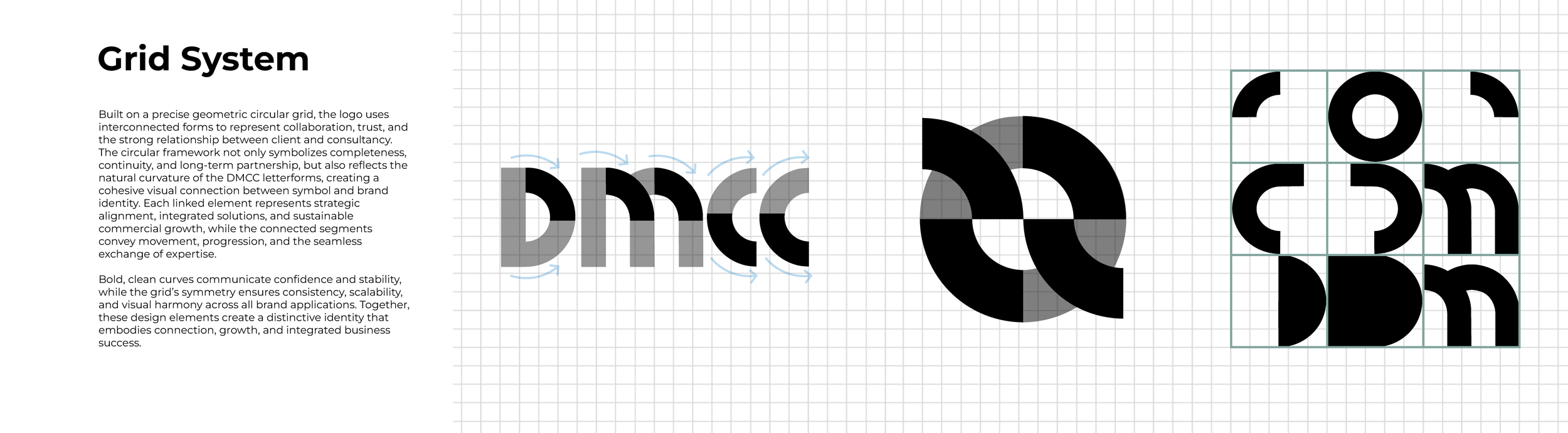
The logo was developed around the initials D, M and C, bringing the three letters together to create a single, distinctive symbol. The forms are interlocked to suggest connection, collaboration and the relationship between different elements of a commercial project, while the geometric construction reflects the structure and precision associated with the construction industry. The result is a mark that feels solid, considered and professional, while remaining simple enough to be instantly recognisable and adaptable across the brand.
DM Commercial Consultants is a commercial consultancy supporting construction projects with tailored, strategic solutions from start to finish. The challenge was to create an identity that communicated expertise and reliability while giving the business a distinctive, contemporary presence.